However, the initial love I felt for Unity wore off after I finished Lucidity 2.4. It felt stale and incomplete and was basically Mac OS X except easier to install on my ASUS notebook without infringing possible copyrights. But for quite some time I avoided trying out GNOME Shell, because I had this thought in my mind that it would somehow not be as amazing as Unity because although GNOME is used by far more people, Ubuntu is quite a power house. I also tried it out in a virtual machine of Fedora 15, but was still not impressed. Then at some point along the line, I decided to try out Fedora 15 on my hard drive to give GNOME Shell a proper try before I decided to write it off. My initial conceptions about it were dead wrong, and I am so immensely happy that I was wrong.

GNOME Shell is an entirely fresh-feeling desktop experience to me; someone who has been a geek staring at computer interfaces since she was around 10 years old. For those who have not tried it or are skeptical about it as I once was, you may wonder what is so new and special about it, so I will try to convey why I feel it is unique and very well done.
The thing I love about it the most, is that it sets itself up as an interface with "two sides." One side is the application side, and the other is the "Activities" side which allows you to control the applications such as which are open, selected, which workspace they are on and etc.

As someone who has done UI art, I have nothing but love and respect for the art team behind GNOME 3's new default look and feel and their product. The entire default theme is set up to reflect the "two sides" of the interface, with all non-application related elements being black and applications being themed a very light grey.

Along with this, by default, there is only a close button on applications. Although the lack of maximise and minimise may annoy some people initially (it did me at first) and they may turn away or enable it via gnome-tweak-tool, there is good reason for this and I highly recommend leaving it as-is. In the way of maximising, windows in GNOME Shell can be maximised by double-clicking their title bars, dragging them to the top edge of the screen or dragging them to the left or right edges for a horizontal half-maximisation. Minimising is quite pointless and is a habit gained from using too many task bars in one's life. Alt+Tab and invoking the Activities view in order to switch windows is much more effectively and better imo. So, although this is really just a removal of some UI elements, it has good reason behind it and feels rather fresh and clean.

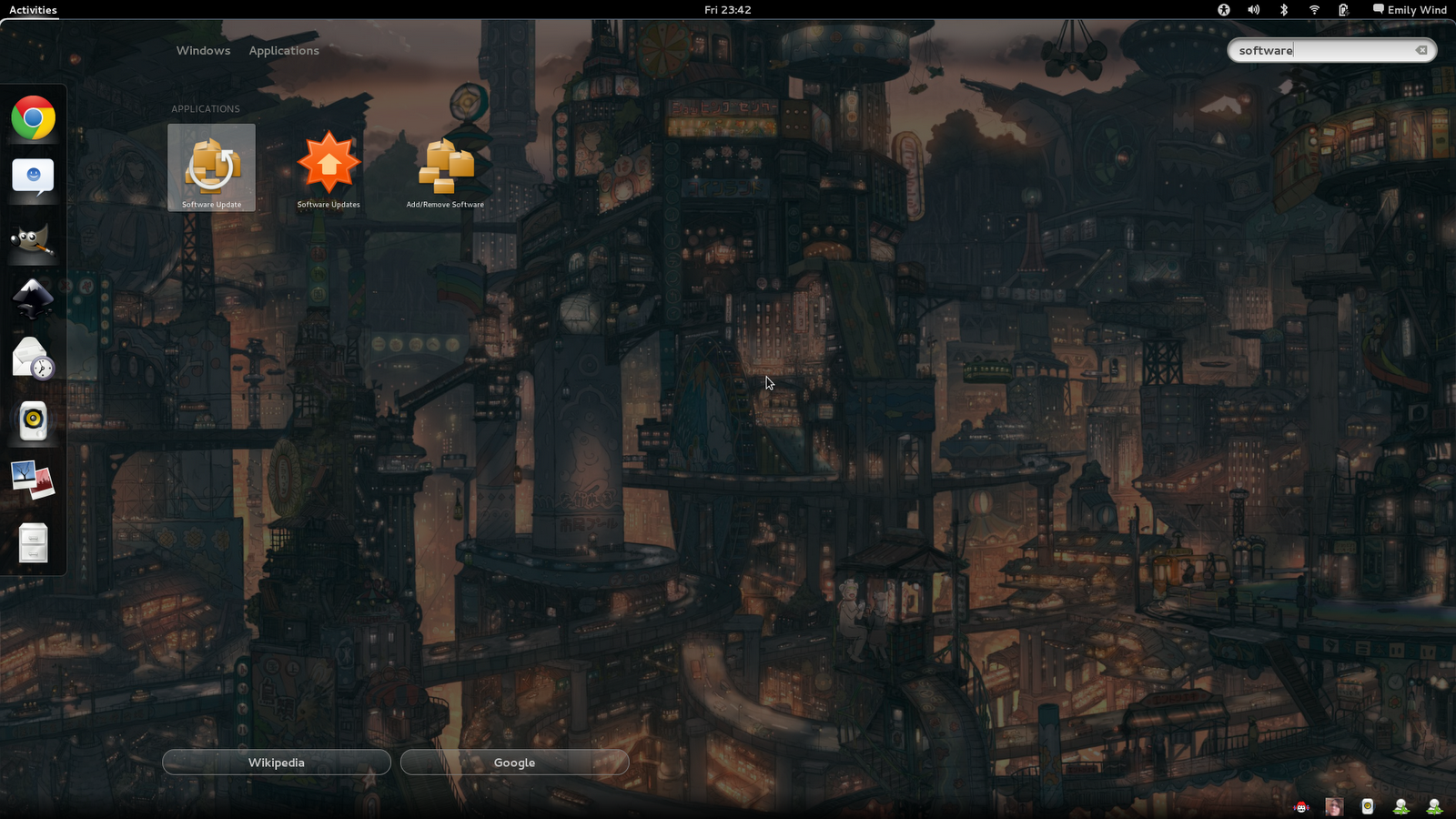
Now let's look deeper at the Activities' side of things, as much of the innovation is found here since Unity technically has the same application-focus as GNOME Shell. In the activities side you will find a reworking of the overhashed system menu, replaced instead with an app wall with categories to the right. Along with this, you get a dock on the left for favourite applications, and a pager on the right when viewing open applications which you can drag applications onto and which has a fluid amount of workspaces, as in always one more than you are using in case you need another, but never any more or less than one more workspace with open applications. On the bottom, which you can also access via dragging the mouse to the bottom right corner at any time, you will find a reworking of the application indicators system which also where you will get useful application notifications, such as IM messages (which also allows you to view messages and reply) or song changes.


Along with this comes the feature to search for applications via typing in the Activities view, along with an option to search on Wikipedia or Google which comes up on the bottom left when you enter something to search. You can find the same feature in Ubuntu's Unity, but without the Wikipedia or Google option and it works slower for some reason.
Overall, the Activities view is an innovative combination of several desktop elements which we have all seen and which work very well; an exposé-like view for switching windows, a dock for opening favourite applications, an application wall and general search feature, combined with a rethought workspace pager which is a quintessential feature of the Linux desktop, existing since some of the first implementations of GNOME and other desktop environments. You could say that certain elements of the GNOME 3 desktop are like those found in Windows or OS X, but I would never say that it is like either of them. It is a completely fresh feeling, and is what a next generation desktop should be; a culmination of the past successful elements with new elements, redundancy removed and a bold new feel.
And last, but not least, even alt+tab is fresh and improved with application-based switching with a twist; you can switch to specific windows within by hovering the icon with your mouse or using the arrow keys, which is denoted by an arrow underneath the application. It also shows all applications from all desktops, with a dividing line between applications to show that one is not in the same place as the others.

As for Unity, Ubuntu can have fun copying Apple and I will happily enjoy a truly unique and next generation-feeling GNOME 3 desktop experience in Fedora. KDE has proven it can copy Windows 7 well, Ubuntu has proven it can copy OS X well, but GNOME has shown it can just be awesome on its own. However, do not take my word and screenshots for it, view the videos on the GNOME home page or try it for yourself; the full experience is well worth it.
Blogger's Note: Sadly, the free Ubuntu stickers I sent for are a bit useless now. :( Guess I should look for some Fedora ones.
No comments:
Post a Comment