Sunday, July 31, 2011

Idea for PulseAudio and GNOME 3's Sound Menu; Default General and Chat Devices

After I post this blog post in order to get my ideas in one spot to help both sides of the equation understand this, I will be submitting bug reports to both PulseAudio and GNOME in order to get this upstream and hopefully it will make the cut for the next release of both.

At the current time, PulseAudio supports setting an application to use a different audio device which you can do through its pavucontrol program, and GNOME 3 supports none of this at all. This means if a new user is using GNOME 3 and wants to use a USB headset and talk to people while listening to music through speakers or play a game with sounds on and talk to people in TeamSpeak, they have to search online in order to find out how to do it.

However, with the current state of PulseAudio, adding such support to the sound menu could be done by giving each application a right-click option to switch to another device, but that would be a bit bothersome if the user used multiple VoIP programs such as Empathy, Skype, TeamSpeak and Mumble, and could confuse some people who don't even know what a sound card is. Plus, PulseAudio likes to "accidentally forget" about devices being default if you unplug them, which is annoying if you have a laptop and USB headset, for example.

:: PulseAudio Side ::

In order for my idea to work, PulseAudio will need to make some changes in the way it operates by supporting the setting of default devices (which will remain after a disconnect and switch to a fallback device only until the set device is plugged back in) to include a default General sound device and a default Chat sound device, or even better, generic device groupings with General and Chat as standard ones which applications can use. Others could then be added by the user for more complex configurations if desired.

Applications which interact with PulseAudio should then get a method to report whether they are Chat devices or not to PulseAudio and selected accordingly. Of course, not all applications will report this properly, which is a problem with Windows 7's implementation of this as well, so in order to resolve that and go a step beyond Windows 7 there should be an option per application to use either the default Chat or default General sound device, along with keeping the option to select a specific device for each, of course.

These, of course, would be a compilation of both a sink and a source which would be set separately as usual.

In pavucontrol the menu for retaining functionality and handling this could like something like the following.

* Use General Device
Use Chat Device
---------------------------------
Use Internal Audio
Use Logitech USB Headset

Doing this at the PulseAudio level would allow for easier implementation and less redundancy in other desktop environments, hence the push for it here rather than only to be added in GNOME 3.

:: GNOME 3 Side ::

With PulseAudio's implementation in place, reflecting it in the sound settings would be the next step. I have made the following mockups for how that could look to save me typing and possibly losing what I mean in translation.


Also, for grandma and grandpa or parents who you set up with Linux so they would not kill Windows with viruses but who just bought a USB headset to talk to you and other family through Google Talk or Skype....


Optionally, just assume to set it as the default chat device and people can change it via the sound settings if they prefer it for everything or do it as a notification rather than a popup. Either behaviour would only occur the first time a device is connected to not interrupt persistent settings and/or annoy the user, of course.

For the sound menu drop-down, there could be something like...


... which would only show controls for the device group playing, or just Volume as usual if nothing but the general output is playing (and only one thing if the General and Chat devices are the same, etc, which could do with a bit of help from PulseAudio to sort that out).

:: In Closing ::

None of this should be considered the only way to implement this feature, of course, but a guideline and food for further thought. However, I think it would be a good step forward in making sound easier to configure in Linux (

Saturday, July 30, 2011

From Ubuntu to Fedora 15; Setting up Wacom, Fonts, and Google Chrome

With my recent move from Ubuntu to Fedora, I was not a huge fan of how the default font rendering looked or the fact that my Wacom tablet was randomly losing it's left-handed rotation I had set up in the config file, and etc. So I am writing this article for those who are not fans of Unity and are jumping over to Fedora while Ubuntu continues to travel in whatever direction it is choosing.

::Wacom::

On the subject of the Wacom tablet, quite confused, I started looking things up on GNOME Shell and Wacom and finally found some stuff which lead to the reality that they added some support for changing Wacom settings in GNOME Shell, but the graphical portion of it is not quite done yet (hopefully we will see it in GNOME 3.2). However, you can fix tablet issues via dconf-editor, which I figured out after a good deal of wanting to pull my hair out.

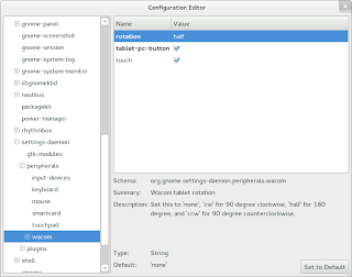
So for starters, install dconf-editor. After that, hit alt+f2 to open the command dialogue and enter in dconf-editor. From there, go to:

org -> gnome -> settings-daemon -> peripherals -> wacom

Within there you can set your rotation as you want, such as half for left-handed tablet orientation, and other options. For me, using a Bamboo Pen tablet, I also had to check tablet-pc-button in order to get the side buttons on my pen working again, for whatever reason.


::Fonts::

For making the fonts look nicer in Fedora 15, this blog post by Andreas Haerter covers it well. It also points out the RPM Fusion Repositories which contain other stuff you might be interested in such as media codecs and nvidia drivers (which are much more up-to-date than the ones in Ubuntu 11.04 to boot).

As an addition, in order to enable the same rendering in Google Chrome since it does not listen to the desktop settings for whatever reason, just download this file, rename it to local.conf and place it in /etc/fonts/.


After the hinting and lcd filtering is enabled, I personally think the default Fedora fonts are much nicer looking than the Ubuntu one.

::Google Chrome::

For those like myself who use Google Chrome you probably want Chrome to fit a bit more in with GNOME 3 instead of standing out like a sore thumb as it does by default. In order to do this you should download the Adwaita Chrome theme and the Adwaita scrollbars addon. After this, right-click in the tab area and check "use system title bar and borders" and you should be good to go.

Friday, July 29, 2011

GNOME Shell; A Next Generation Desktop Experience

As a long time user of Ubuntu for the Linux side of my computer and someone who enjoys various elements of the OS X, I was quite excited for the release of Unity and had managed to sit GNOME Shell in the back of my mind due to some of my earlier experiences with its less beautiful ancestors (i.e. when it looked like this and other early releases). At first I was in love with Unity and set to work completing my Lucidity 2.4 theme which I had let rot for nearly a year due to playing too much WoW and spending all my time in Windows 7. However, as someone who uses a computer for everything she does, from drawing to writing to coding to school work and beyond, I tend to get tired staring at the same UI for too long so I went to give Unity a try.

However, the initial love I felt for Unity wore off after I finished Lucidity 2.4. It felt stale and incomplete and was basically Mac OS X except easier to install on my ASUS notebook without infringing possible copyrights. But for quite some time I avoided trying out GNOME Shell, because I had this thought in my mind that it would somehow not be as amazing as Unity because although GNOME is used by far more people, Ubuntu is quite a power house. I also tried it out in a virtual machine of Fedora 15, but was still not impressed. Then at some point along the line, I decided to try out Fedora 15 on my hard drive to give GNOME Shell a proper try before I decided to write it off. My initial conceptions about it were dead wrong, and I am so immensely happy that I was wrong.


GNOME Shell is an entirely fresh-feeling desktop experience to me; someone who has been a geek staring at computer interfaces since she was around 10 years old. For those who have not tried it or are skeptical about it as I once was, you may wonder what is so new and special about it, so I will try to convey why I feel it is unique and very well done.

The thing I love about it the most, is that it sets itself up as an interface with "two sides." One side is the application side, and the other is the "Activities" side which allows you to control the applications such as which are open, selected, which workspace they are on and etc.


As someone who has done UI art, I have nothing but love and respect for the art team behind GNOME 3's new default look and feel and their product. The entire default theme is set up to reflect the "two sides" of the interface, with all non-application related elements being black and applications being themed a very light grey.


Along with this, by default, there is only a close button on applications. Although the lack of maximise and minimise may annoy some people initially (it did me at first) and they may turn away or enable it via gnome-tweak-tool, there is good reason for this and I highly recommend leaving it as-is. In the way of maximising, windows in GNOME Shell can be maximised by double-clicking their title bars, dragging them to the top edge of the screen or dragging them to the left or right edges for a horizontal half-maximisation. Minimising is quite pointless and is a habit gained from using too many task bars in one's life. Alt+Tab and invoking the Activities view in order to switch windows is much more effectively and better imo. So, although this is really just a removal of some UI elements, it has good reason behind it and feels rather fresh and clean.


Now let's look deeper at the Activities' side of things, as much of the innovation is found here since Unity technically has the same application-focus as GNOME Shell. In the activities side you will find a reworking of the overhashed system menu, replaced instead with an app wall with categories to the right. Along with this, you get a dock on the left for favourite applications, and a pager on the right when viewing open applications which you can drag applications onto and which has a fluid amount of workspaces, as in always one more than you are using in case you need another, but never any more or less than one more workspace with open applications. On the bottom, which you can also access via dragging the mouse to the bottom right corner at any time, you will find a reworking of the application indicators system which also where you will get useful application notifications, such as IM messages (which also allows you to view messages and reply) or song changes.


Along with this comes the feature to search for applications via typing in the Activities view, along with an option to search on Wikipedia or Google which comes up on the bottom left when you enter something to search. You can find the same feature in Ubuntu's Unity, but without the Wikipedia or Google option and it works slower for some reason.


Overall, the Activities view is an innovative combination of several desktop elements which we have all seen and which work very well; an exposé-like view for switching windows, a dock for opening favourite applications, an application wall and general search feature, combined with a rethought workspace pager which is a quintessential feature of the Linux desktop, existing since some of the first implementations of GNOME and other desktop environments. You could say that certain elements of the GNOME 3 desktop are like those found in Windows or OS X, but I would never say that it is like either of them. It is a completely fresh feeling, and is what a next generation desktop should be; a culmination of the past successful elements with new elements, redundancy removed and a bold new feel.

And last, but not least, even alt+tab is fresh and improved with application-based switching with a twist; you can switch to specific windows within by hovering the icon with your mouse or using the arrow keys, which is denoted by an arrow underneath the application. It also shows all applications from all desktops, with a dividing line between applications to show that one is not in the same place as the others.


As for Unity, Ubuntu can have fun copying Apple and I will happily enjoy a truly unique and next generation-feeling GNOME 3 desktop experience in Fedora. KDE has proven it can copy Windows 7 well, Ubuntu has proven it can copy OS X well, but GNOME has shown it can just be awesome on its own. However, do not take my word and screenshots for it, view the videos on the GNOME home page or try it for yourself; the full experience is well worth it.

Blogger's Note: Sadly, the free Ubuntu stickers I sent for are a bit useless now. :( Guess I should look for some Fedora ones.

Saturday, July 16, 2011

Crafting of Lucidity 2.4 and the Future of Lucidity

Those of you who are here likely know that I am the creator of the GTK theme known as Lucidity. Those who have used it before version 2.4 may also know that it was originally a fork of a theme by the same name done by Issiah Heyer, and before that it was just a mockup which caught my attention. Since then, Lucidity has changed a lot and moved quite far from the original mockup and left all the code and buttons from Issiah Heyer's version behind as I slowly developed it with a look and feel of its own. Overall I want to keep Lucidity true to the name more than anything else, as in a theme which is very clean and smooth, and I shall cover how I aimed to improve that with the production of Lucidity 2.4 as well as point out some features people might enjoy.

One of the biggest changes in Lucidity 2.4 is the merging of elements from what used to be separate light and dark themes. As in, while the title bars used to be a light grey in the normal theme and everything was dark in the dark theme, I did away with the dark themes and instead Lucidity 2.4 has dark titlebars, menu and a dark panel. The reasoning behind this is to provide further clear contrast and distinction between a menu and a window. Along with this, a thin black border was added to the windows in order to give clear window boundaries for people not using shadows on their windows.


Due to Ubuntu's Unity turning the panel into the window title area complete with close, minimise and maximise buttons, the new window title and panel have the same gradient to provide a subtle sort of message along the lines of "this is now has the window controls. This also results in a nice fade in to applications such as Google Chrome, Firefox and Ubuntu One (along with application menus if not using Unity) which have dark backgrounds up top as seen in the screenshot to the right. Not only does this help illustrate the panel functioning as the title bar as well, it also looks nice and keeps with the smooth goal for the theme and also looks very clean.


The next big change is the addition of monochrome icons. However, in 2.4 final I removed some of the ones which were seen in the beta releases in favour of a more colourful desktop and a more minimal application of monochrome. I based which icons got a monochrome version on which icons are a flat colour in Ubuntu's Humanity icon set, and as a result they are now seen for navigation controls, magnification and a few other actions rather than being as rampant as the ones in the Faenza icon set. The idea is to only affect icons where the shape of the icon itself portrays the action well on its own without needing more colour or definition, and to keep the monochrome icons guiding the desktop experience but not defining it; leaving the rest up to whatever the user selects as the partner icon set (which is DanRabbit's elementary icon set in the screenshot).


Some smaller tweaks I made which help provide a nice new look but are not as apparent as the bigger colour changes and icon additions include lowering the contrast of buttons to give them smoother borders and fixing various parts of the dark themed areas such as giving scale sliders and the sound menu track controls a lighter black highlight instead of the bright white highlight of menu items that they had in the beta releases.


As for GNOME3/GTK3, I will be doing a GTK3 version shortly but I wanted to get Lucidity 2.4 finished first and to a point where I like everything about it before I start learning how to theme GTK3 to give a nice base for what I want it to look like in the end. However, Lucidity will be getting a GTK3 version in its next release and will be moving up to version 3.0 itself. I will be developing it in Ubuntu Oneiric and Fedora 15 virtual machines to ensure it looks good in both Unity and GNOME Shell, and intend to have it ready as soon as I feel it lives up to the quality of the GTK2 version.